Customer Experience · September 10, 2026
How Netflix Personalizes CX: Inside the Algorithm's Design
Netflix's homepage isn't a menu — it's the product. Here's how behavioral data, not demographics, drives 80% of what subscribers watch.
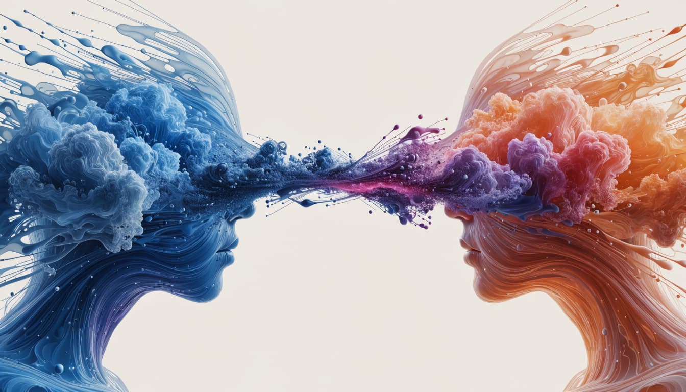
Open Netflix on any given evening and the first thing you see is never a blank search bar. It's a wall of titles arranged as if someone has been quietly watching you for years — because, in a sense, they have. That wall is not a menu. It's an argument, built row by row, about what you'll want to watch in the next ten seconds, and it is the single most consequential design decision Netflix ever made.
The thesis is simple and, for most brands, uncomfortable: Netflix's personalization is not a feature layered on top of its content library. It is the product. Strip away the recommendation engine and Netflix becomes an unremarkable catalogue competing on price and volume against every other streaming service. With it, Netflix becomes something closer to a companion that appears to know your mood before you've named it — and that difference is measurable. Netflix has disclosed that more than 80% of the hours streamed on the platform originate from its recommendation system rather than from active searches, meaning the algorithm, not the search bar, is doing the vast majority of the selling. That single figure reframes what "customer experience" means for a business built on choice. When four-fifths of demand is generated rather than requested, the experience isn't a support layer around the product — it is the acquisition, retention and monetization strategy, running quietly in the background of every home screen.
What actually powers Netflix's personalization?
Netflix's recommendation system is built on behavioral signals, not demographics. It pays far more attention to what you watch, when you abandon it, what you rewatch, and what you scroll past than to who you are on paper — age, gender or location tell it almost nothing useful compared to a single evening of viewing behavior. This is a deliberate rejection of the marketing industry's default unit of analysis, the demographic segment, in favor of a unit built entirely from observed behavior.
The practical implication is one every experience leader should sit with: two subscribers of identical age, income and location can receive completely different homepages, because Netflix has learned they belong to different taste communities rather than different demographic boxes. Journalist Alexis Madrigal explored this in his account of how the company mapped the vast majority of film and television into thousands of ultra-specific micro-genres, published as "How Netflix Reverse Engineered Hollywood" (Alexis Madrigal, The Atlantic, January 2014). The point wasn't the genre labels themselves — it was the underlying principle: taste is a more accurate predictor of behavior than identity.
For any CX leader working from a customer segmentation model built on income bands or age brackets, this is the uncomfortable lesson. Behavior beats demography every time it's tested against it, and Netflix has built its entire architecture on that bet.
Why doesn't Netflix just ask people what they want to watch?
Because asking is expensive, and choosing is exhausting. Every additional decision a customer has to make before reaching value is friction, and Netflix's entire home screen is an exercise in removing that friction before the customer feels it. This is choice architecture in its purest commercial form — a term Richard Thaler and Cass Sunstein popularized in Nudge (Yale University Press, 2008) to describe how the way choices are presented shapes the choices people make, independent of the options themselves.
A subscriber with 15,000 titles available and no organizing structure faces what behavioral economists call choice overload: too many options degrade decision quality and satisfaction rather than improving them. Netflix's rows — Continue Watching, Trending Now, Because You Watched — don't reduce the catalogue. They reduce the decision. The catalogue stays enormous; the felt choice shrinks to a handful of rows, each pre-filtered by relevance. That's the trick: abundance without overload.
This is also where the platform's most quoted design decision lives — autoplay. The next episode doesn't wait for a request; it plays unless you intervene. That's a default, not a suggestion, and defaults are famously sticky. People overwhelmingly stay on the path of least resistance, which is precisely why Thaler and Sunstein built an entire policy framework around setting the "right" default. Netflix's default is built for engagement, and it works because most people, most of the time, would rather not decide again.
How does "Continue Watching" keep people coming back?
The progress bar sitting under a half-finished series is doing more behavioral work than almost any other element on the screen. It exploits the goal-gradient effect — the finding that motivation to complete a task intensifies the closer someone gets to the finish line. The effect was formally demonstrated by Ran Kivetz, Oleg Urminsky and Yuhuang Zheng in "The Goal-Gradient Hypothesis Resurrected: Purchase Acceleration, Illusionary Goal Progress, and Customer Retention" (Journal of Marketing Research, 2006), which found that customers accelerate effort as a visible goal nears completion — even when the goal itself is somewhat illusory.
Netflix's Continue Watching row is a bank of unfinished goals, each rendered as a visible bar of progress. A show at 40% complete isn't just content sitting in a queue; it's an open loop the brain wants closed. That's not an accident of interface design — it's a direct, deliberate application of a documented psychological mechanism to a subscription retention problem. Every unfinished title is a small, standing reason not to cancel.
Does personalized artwork actually change what people watch?
Netflix doesn't only personalize which titles appear — it personalizes how those titles look. The same series can be represented by different cover images to different viewers, chosen based on which actor, tone or scene is likeliest to resonate with that person's viewing history. This is the affect heuristic at work: people don't evaluate options by weighing evidence, they react to how an option makes them feel in the half-second before conscious thought kicks in. A thumbnail is judged in that half-second, long before a synopsis gets read.
For a service delivering an average of one homepage per subscriber rather than one homepage for all subscribers, that's a genuinely different design philosophy than most digital products attempt. Most brands personalize the offer. Netflix personalizes the emotional cue that gets someone to click on the offer in the first place — a subtler and, arguably, more powerful lever.
What role does social proof play on the Netflix homepage?
Rows like "Trending Now" and the numbered Top 10 lists aren't neutral information — they're social proof, the well-documented tendency to treat other people's choices as evidence about the right choice, formalized by Robert Cialdini in his work on the principles of influence. A title ranked #3 doesn't need to convince you on its own merits; it borrows credibility from the number of other people already watching it. Numbered lists compound the effect further by adding a second cue — the anchoring effect of ordinal rank — so a title at #1 feels categorically more validated than one at #7, even if the underlying viewership gap between them is modest. Combined with personalized rows built from individual taste data, Netflix layers two entirely different forms of trust — "people like me" and "people in general" — on the same screen, and lets whichever one lands first do the persuading.
What can other customer experience leaders actually copy from this?
Most organizations can't build a recommendation engine on Netflix's scale, and shouldn't try to. But the underlying principles transfer to any business with a customer journey complex enough to create decision fatigue — which is nearly all of them. A practical sequence for adapting the model looks like this:
- Map the journey before touching the algorithm. Netflix's personalization works because it's applied to a well-understood sequence of moments — browse, select, watch, resume. Most CX teams try to personalize a journey they've never actually mapped stage by stage, which guarantees the personalization lands on the wrong moment.
- Replace demographic segments with behavioral ones. Build customer archetypes from what people actually do — abandon, rebook, complain, renew — rather than from who they are on a form. Behavior predicts the next action far better than a persona built on age and income ever will.
- Design the default, don't just design the option. Decide deliberately what happens if the customer does nothing — the pre-selected plan, the pre-ticked box, the next step that plays automatically — because a default is a decision on the customer's behalf whether you intend it to be or not.
- Give customers visible progress, not just a finish line. Whether it's a loyalty tier, an onboarding checklist or a claims process, a progress bar people can see accelerates completion far more reliably than a description of the eventual reward.
- Use real signals of social proof sparingly and honestly. "Most popular" or "highly rated" only works as a nudge if it's true and specific — vague appeals to popularity erode trust faster than they build it.
None of this requires Netflix's engineering budget. It requires the discipline to treat every screen, every message and every default as a design decision rather than an afterthought — which is precisely the discipline behind journey design done properly, and the reasoning underneath most effective applications of behavioral economics in customer experience.
Where does personalization at this scale start to work against the customer?
Netflix's model is a genuine achievement in reducing friction, but it carries a structural risk worth naming plainly: a system this good at predicting what you'll watch next can just as easily narrow what you're ever shown at all. Recommendation engines optimized purely for continued engagement have an inherent bias toward the familiar, because the familiar is what's easiest to predict a positive response to. The same mechanism that makes Netflix feel effortlessly relevant can, left unchecked, quietly shrink a customer's world to a smaller and smaller loop of variations on what they already liked last week. This is the trade-off every personalization strategy eventually confronts, and it's the reason the discipline behind it matters as much as the technology. Personalization built only to maximize the next click is optimizing for the platform. Personalization built to serve the customer's actual, evolving taste — including the discomfort of the occasional genuine surprise — is optimizing for the relationship. Netflix's engineers have talked publicly for years about tuning this balance; it is not a solved problem, for them or for anyone building on the same logic.
What's the real lesson for brands outside streaming?
The uncomfortable truth in Netflix's numbers is that most customers don't want more choice — they want to feel understood quickly enough that choosing stops being work. That's a service design problem before it's a data science problem, and it's one that applies just as directly to a bank's mobile app, a retailer's product feed, or an airline's booking flow as it does to a streaming homepage. Getting there starts with the same unglamorous groundwork Netflix did before any algorithm existed: understanding the journey stage by stage, building a proper picture of customer archetypes grounded in behavior, and being deliberate — genuinely deliberate — about every default a customer will encounter. Businesses in entertainment and leisure watching this model unfold have the clearest read-across, explored further in Renascence's work on entertainment and leisure customer experience, but the mechanics travel far beyond streaming. For leaders looking to see how close their own organization is to this level of behaviorally grounded design, a structured look at customer experience strategy is the more honest starting point than another recommendation-engine procurement conversation. The algorithm was never the hard part. Knowing exactly which moment in the journey deserves it, is.
Netflix didn't win the personalization game by knowing more about its customers than anyone else. It won by refusing to make them ask twice. That's a lower bar than most businesses assume, and a harder one than most businesses are currently clearing.
Further reading
FAQ
Questions we get on this topic
Related reading
Writing on how human behavior shapes the experiences brands deliver — at the intersection of behavioral economics and customer experience.
Stay ahead of CX
Get the Journal in your inbox.
Insights, frameworks and event round-ups from the Renascence team. No spam, ever.