
Service Design · October 1, 2026
From Journey Maps to Journey Analytics: A Measurement Playbook
Most journey maps get laminated and forgotten. Here's how to turn a static mapping exercise into a living measurement system that tracks whether the experience actually improves.

Most journey maps die the day they're laminated. They go up on a wall, get photographed for a workshop recap deck, and then nobody touches them again until someone senior asks why NPS hasn't moved in eighteen months. The map was never wrong, exactly. It was just never built to be checked.
That's the real divide in service design today — not between companies that map journeys and companies that don't, but between companies that treat the map as a static artefact and companies that treat it as a living measurement system. A journey map tells you what should happen. Journey analytics tells you what did. The gap between those two sentences is where most CX investment quietly evaporates.
This article is about closing that gap: how a mapping exercise becomes a measurement discipline, what to actually score, and why the behavioural economics of memory — not just the operational facts of a touchpoint — have to be part of the model.
Why do most journey maps fail to change anything?
Because they are drawn once, by a room full of good intentions, and then frozen. A workshop produces a beautiful artefact: swimlanes, personas, sticky notes converted into a polished PDF. Everyone nods. Six months later, the contact centre has launched a new IVR, the app team has shipped three releases, and the map still shows the old flow. It was never wired to anything that changes.
There's a second, quieter failure mode: maps built entirely from internal assumption. A product owner's best guess at how a customer feels at "document upload" stands in for actual evidence. The Nielsen Norman Group's guidance on journey mapping makes the same point from a UX angle — a map is only as credible as the research underneath it, and a map built on internal opinion rather than observed behaviour is theatre, not diagnosis.
The fix isn't "map more often." It's building the map so it can be measured from day one — so that every stage, step and touchpoint carries a number that can move, be tracked, and be argued about with evidence rather than opinion.
What's the actual difference between a journey map and journey analytics?
A journey map is a model of intent: the stages a customer moves through, the steps within each stage, and the touchpoints where they interact with your brand. Journey analytics is the measurement layer laid on top of that model — the scoring, the trend lines, the flagged moments of truth, the evidence from real customers that confirms or contradicts the model's assumptions.
Think of it the way a service blueprint separates the frontstage (what the customer sees) from the backstage (the processes, systems and people that produce it). A journey map without analytics is frontstage-only — a nice story about the customer's experience with no mechanism to check whether the story is true. Journey analytics forces the backstage question: what did we actually measure at each step, and does the evidence match the narrative we drew in the workshop?
In practice, three things separate a map from an analytics system:
- A score, not just a label. "Frustrating" is an adjective. A quantified experience score — even a simple -5 to +5 scale per touchpoint — is a number you can track, compare, and defend in a budget meeting.
- A refresh cycle. Analytics implies the measurement updates — weekly, monthly, per cohort — while a static map implies it was true once, in a workshop room, and stays true forever.
- A link to evidence. Real transcripts, survey comments, support tickets and session recordings attached to the touchpoint they describe, not summarised into a vague "pain point" bubble.
How do you turn a static map into something measurable?
You stop treating "map the journey" and "measure the journey" as two separate projects. They're one project with two outputs, and the second only works if the first is structured correctly.
Start with the structure itself. A journey should be decomposed into stages (the macro phases — awareness, onboarding, usage, renewal), steps within each stage, and touchpoints within each step — the individual channel interaction where something actually happens: a call, a form, an app screen, a branch visit. This is the same decomposition behind any proper CX journey framework, and it matters because you cannot attach a score to "onboarding." You can attach a score to "customer uploads ID document via mobile app during week one." Granularity is what makes measurement possible.
Once the structure exists, each touchpoint needs three attached facts before it can carry a number: the channel it happens on, the job the customer is trying to do at that moment, and the friction or delight already observed there. Only then does a score mean anything — otherwise you're scoring a box on a slide, not a moment a real person lived through.
- Decompose the journey into stages, steps and touchpoints — granular enough that each touchpoint is a single, discrete interaction, not a phase.
- Attach evidence to each touchpoint — pull real voice-of-customer data, support logs, or session data rather than relying on the workshop room's best guess.
- Score every touchpoint on a consistent scale — a transparent, repeatable method beats a one-off sentiment survey; the scale matters less than its consistency across the whole journey.
- Plot the scores as an arc, not a table — sequence matters as much as magnitude; a dip followed by a strong recovery reads very differently from a flat, mediocre line.
- Flag the moments of truth automatically — the touchpoints where the score swings hardest, positively or negatively, deserve investigation before the quietly-mediocre middle of the journey does.
- Re-score on a cycle, not a one-off — monthly or quarterly, tied to actual operational or product changes, so the map updates with reality instead of ageing in a drawer.
- Route weak touchpoints into a tracked roadmap — a score with no owner and no deadline is just a diagnosis nobody treats.
That seventh step is the one most organisations skip, and it's the one that determines whether the whole exercise was worth doing. A scored journey with no roadmap is a more expensive version of the laminated map — better data, same fate.
Which metrics actually belong on a journey — and which ones lie to you?
NPS, CSAT and CES are useful, but they were built to summarise a relationship or a single transaction, not to diagnose a forty-touchpoint journey. Attach one relationship-level NPS score to an entire onboarding flow and you've learned almost nothing about which of the eleven steps inside it actually broke trust. Fred Reichheld introduced the Net Promoter methodology in his 2003 Harvard Business Review article "The One Number You Need to Grow", and it was designed — explicitly — as a growth predictor, not a touchpoint diagnostic. Using it as the latter is a category error that a lot of CX programmes still make.
The more useful unit of measurement is the touchpoint-level score, rolled up into an emotional arc across the journey. That arc does something the three legacy metrics can't: it shows sequence. A journey that dips hard at step three and recovers beautifully by step nine scores very differently in aggregate than one that's flat and mediocre throughout — even if the average looks identical on a dashboard. Averages hide exactly the information a service designer needs.
This is also where the perception gap becomes dangerous. In its 2005 study Closing the Delivery Gap, Bain & Company found that the large majority of companies believed they delivered a superior customer experience, while only a small fraction of their customers agreed. A journey map built from internal confidence and never checked against measured customer evidence is exactly the mechanism that produces that gap. Analytics is the correction — it's the thing that forces the internal story to meet the external evidence.
How does behavioural economics change what you choose to measure?
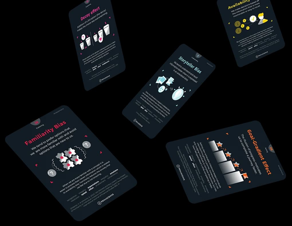
This is where most journey analytics frameworks quietly go wrong: they average everything, which is precisely what customer memory doesn't do. Daniel Kahneman's peak-end rule holds that people judge an experience largely by its most intense moment and its final moment, not by the mean of everything in between. The landmark evidence comes from Donald Redelmeier and Daniel Kahneman's 1996 study of colonoscopy patients, published in the journal Pain, which found that patients' retrospective rating of pain correlated far more closely with the peak intensity and the ending than with the total duration of discomfort endured.
Apply that to a journey map and the implication is uncomfortable: a flawless average score across thirty touchpoints is worth less than getting the single worst moment and the final moment right. If your journey ends on a clunky confirmation screen or a cold "ticket closed" email, that ending is doing disproportionate damage to the relationship, no matter how smooth the twenty-nine steps before it were. Journey analytics that reports a single blended average is burying the one insight that actually predicts loyalty.
Loss aversion earns its place in the same analysis. Customers weight a drop in service quality more heavily than an equivalent improvement — a courier who's usually early and is late once generates more anger than the goodwill earned by five on-time deliveries. That means your scoring model shouldn't just track the average trend line; it should flag volatility. A touchpoint that swings between a +4 and a -3 depending on the week is a bigger risk than one that sits at a flat +1, even though its average looks fine. Behavioural economics tells you where to point the analytics; the scoring engine just needs to be built to notice.
What does a practical measurement system actually look like in a CX team?
In the consultancies and in-house CX functions that do this well, the system has four layers, and none of them is optional.
- The structural layer — the decomposed journey (stages, steps, touchpoints) that gives every subsequent number a home.
- The scoring layer — a consistent, transparent method for turning observed experience into a number per touchpoint, applied the same way every cycle so trend lines mean something.
- The evidence layer — real voice-of-customer data (call transcripts, reviews, survey verbatims, support tickets) linked to the touchpoint it describes, so a score is never just a guess dressed up as a statistic.
- The action layer — a roadmap that converts the weakest-scoring touchpoints into owned initiatives with deadlines, closing the loop between measurement and change.
Most teams have built the first layer reasonably well — mapping workshops are common practice now. Far fewer have built the second and third, which is why so many "customer journey programmes" amount to a map, a handful of surveys, and no system connecting them. This is also the gap that software has started to close properly. Renascence's own platform, René Studio, was built specifically to close it: journeys are mapped as structured data rather than static slides, every touchpoint carries a quantified score (its Experience Impact Score engine, EXIS), the scores plot automatically into an emotional arc that flags moments of truth, and weak touchpoints convert directly into a tracked roadmap with owners and deadlines — so the measurement layer and the action layer live in the same workspace instead of three disconnected tools.
Whatever platform or process you use, the principle holds regardless of tooling: a map that can't be re-scored on a cycle isn't a measurement system, it's a poster.
Where does journey analytics break down in practice?
It breaks down in three predictable places, and knowing them in advance saves a lot of wasted workshop time.
The first is granularity drift. Teams start with a properly decomposed journey and then, under time pressure, start scoring at the stage level instead of the touchpoint level because it's faster. The resulting number is comfortable and useless — you can't act on "onboarding scored 2.1" the way you can act on "ID verification via mobile app scored -3."
The second is evidence laundering. A touchpoint gets scored based on what the project team believes rather than what customers actually said, because gathering real transcripts and verbatims takes longer than guessing. This is where a disciplined voice of customer strategy earns its keep — it's the mechanism that forces every score back to an actual quote, ticket, or session rather than a confident assumption in a workshop room.
The third, and the most common, is measurement without ownership. A dashboard lights up red at three touchpoints, everyone agrees it's concerning, and nothing happens because no single person is accountable for moving the number. This is a change management problem dressed up as an analytics problem — the data was never the bottleneck.
What should a CX leader do with all of this on a Monday morning?
Pick one journey — the one with the worst number from the last customer survey you ran — and decompose it properly before you touch a single metric. Attach real evidence to each touchpoint. Score it consistently. Plot the arc and look for the moment of truth, not the average. Then put one name and one deadline against the weakest point on that arc. Do that once, properly, and you'll have a template for every journey after it — and a far harder question to answer the next time someone asks why the map on the wall hasn't changed in eighteen months.
If you want a structured way to see how your organisation's measurement discipline stacks up before you start, Renascence's CX Maturity Assessment scores where the gaps sit across the full set of CX building blocks, including measurement. And if the real bottleneck turns out to be the underlying design of the journey rather than the scoring method, that's a conversation worth having with a service design team before you commission another round of surveys.
The map was never the deliverable. It was always the hypothesis. Journey analytics is simply the discipline of going back and checking whether it was ever true — and having the nerve to redraw it when it wasn't.
Further reading
FAQ
Questions we get on this topic
Related reading



Writing on how human behavior shapes the experiences brands deliver — at the intersection of behavioral economics and customer experience.
Stay ahead of CX
Get the Journal in your inbox.
Insights, frameworks and event round-ups from the Renascence team. No spam, ever.