








Service Design · August 5, 2026
AI Journey Map Generators: What They Fix and What They Don't
AI-powered generators inside journey mapping software solve the blank-page problem — but only if teams interrogate the output. Here's what the shift actually means.

Most journey maps die in the meeting where they're born. They're built in a workshop, celebrated on a wall, and forgotten by the following quarter — not because the people who made them didn't care, but because the tool they used couldn't keep pace with the organisation. A static slide or a sticky-note photograph is a record of a conversation, not a living model of how customers actually move through your world.
The arrival of AI-powered generators inside journey mapping software changes that equation in a specific, practical way. Not by replacing the thinking — the thinking is irreplaceable — but by collapsing the distance between "we should map this" and "we have something we can actually work with." This article examines what that shift means, where it genuinely helps, where it doesn't, and how to choose the right tool for the level of rigour your organisation needs.
What Is Journey Mapping Software, and Why Does the Generator Question Matter?
Journey mapping software is a dedicated workspace for building, storing, analysing, and improving customer journey maps — the structured representations of how a customer moves through an experience, from first awareness to post-purchase behaviour. Unlike a whiteboard or a presentation tool, purpose-built software treats each stage, step, and touchpoint as a data object: something that can be scored, compared, versioned, and connected to evidence.
The generator question matters because the most common failure mode in journey mapping is not analytical — it is initiatory. Teams know they should map. They convene the right people. Then they stare at a blank canvas and spend the first two hours debating what to call the stages. By the time they've agreed on a structure, energy has dissipated and the session has become a formatting exercise rather than a diagnostic one.
An AI generator addresses exactly that failure mode. It gives a team a credible first draft — stages, steps, touchpoints, customer goals — that they can immediately challenge, enrich, and correct with real knowledge. The blank page problem is solved; the substantive work begins faster.
The generator's job is not to replace the practitioner's judgment. It is to make the practitioner's judgment easier to exercise — by providing a structured starting point that can be interrogated rather than invented.
How AI Journey Map Generators Actually Work
The mechanics vary by platform, but the underlying logic is consistent. The user provides context — typically the customer segment, the channel mix, the industry, and the specific challenge being addressed — and the AI produces a structured framework: stages in sequence, steps within each stage, touchpoints, and often an initial read on customer goals or pain points at each moment.
Custellence, a Stockholm-based journey mapping platform, launched its AI-powered journey map generator on 3 June 2025. Under the leadership of CEO Karin Sjödin and Co-founder and CXO Sabina Persson, the tool was built around five guiding questions covering segment, channel, industry, and business challenge. The output is a fully editable, collaborative map with stages, steps, touchpoints, customer goals, and AI-suggested opportunities mapped to business outcomes — designed to be a starting scaffold, not a finished artefact.
That distinction — scaffold versus artefact — is the right way to think about any AI generator in this space. The map it produces is a hypothesis. The team's job is to stress-test it against what they actually know: verbatim customer feedback, operational data, mystery shopping observations, frontline staff experience. A generator that produces a plausible-looking map which no one then interrogates is worse than no map at all, because it creates false confidence.
Why the "Blank Page" Problem Is a Behavioural Problem, Not Just a Practical One
The blank canvas triggers what behavioural economists call choice overload — when the number of available options is so large that decision quality degrades and people default to inaction or low-effort choices. A journey map with no constraints is, paradoxically, harder to build than one with a draft to react to.
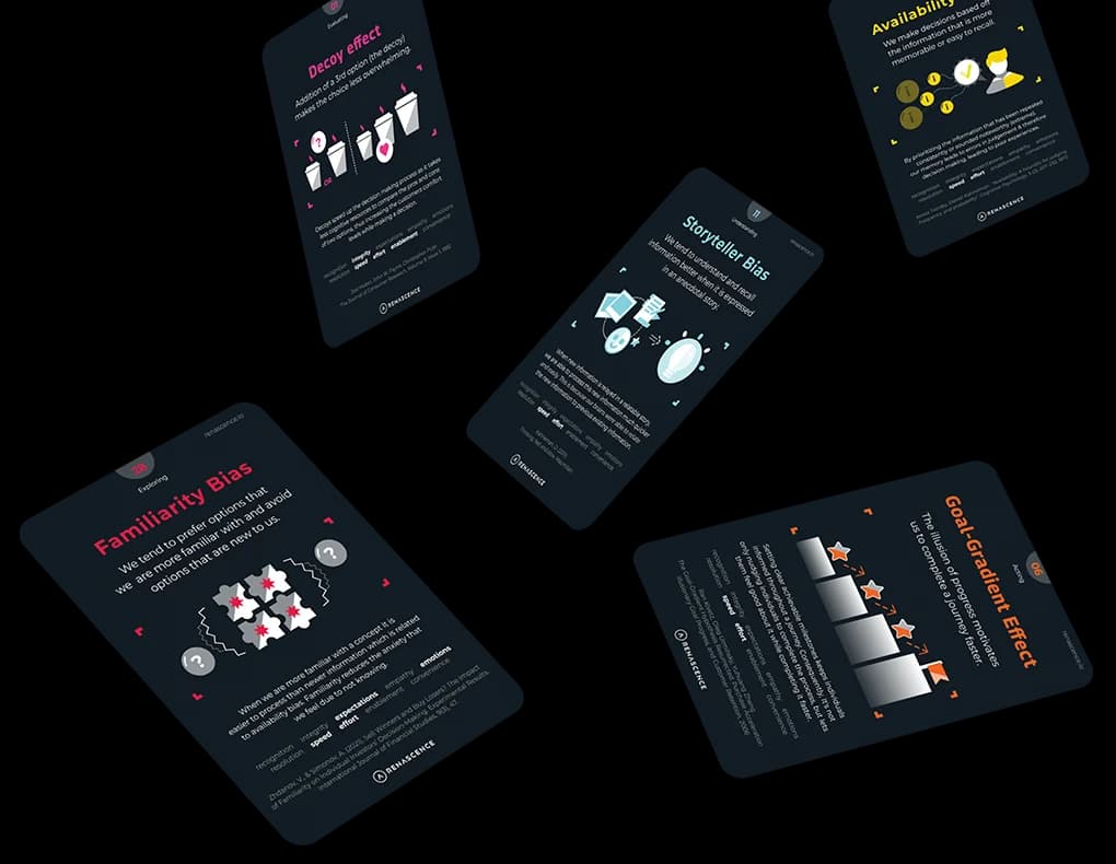
There is also a related effect: the IKEA effect, first described by Michael Norton, Daniel Mochon, and Dan Ariely in their 2012 paper "The 'IKEA Effect': When Labor Leads to Love" (Journal of Consumer Psychology, 22(3)). People value things they have partially built more than things handed to them complete. A generator that produces 70% of the structure and leaves the team to supply the remaining 30% — the real customer insight, the scored pain points, the specific evidence — creates exactly the right conditions for ownership. The team improves the map rather than receiving it, and they are more likely to act on what they helped construct.
This is not a trivial point. The single biggest predictor of whether a journey map produces change is not its accuracy at the time of creation — it is whether the people who need to act on it feel responsible for it. A well-designed generator, used well, increases that sense of ownership rather than undermining it.
Free vs. Paid Journey Mapping Software: What the Distinction Actually Signals
The free-versus-paid question is often framed as a budget question. It is really a maturity question.
Free or freemium tools — including basic tiers of several well-known platforms — are appropriate when the primary goal is visualisation: producing a map that communicates a journey to a stakeholder audience. They are typically limited in collaboration features, version control, data integration, and scoring capability. For a team doing its first journey map, or mapping a single touchpoint for a specific project, a free tier may be entirely sufficient.
Paid tools earn their cost when the goal shifts from visualisation to operationalisation. That shift happens when you need to:
- Score touchpoints consistently across multiple journeys and compare them over time
- Connect map data to Voice of Customer evidence — survey results, complaint themes, NPS verbatims — so the map reflects what customers actually report rather than what the team assumes
- Assign owners and deadlines to improvement initiatives that emerge from the map
- Maintain a live, versioned record of current-state versus future-state design
- Collaborate across functions — operations, digital, marketing, frontline — without the map living in one person's file
- Report to leadership on journey health as a business metric, not just a design artefact
The practical test: if your journey map needs to survive a leadership review, a quarterly business update, or an operational handover, a free visualisation tool will almost certainly fail you — not because it draws badly, but because it cannot hold the data, the evidence, or the accountability structure that makes a map actionable.
Choosing Journey Mapping Software: The Questions That Actually Differentiate
Most software comparison guides evaluate features in isolation. The more useful frame is to ask what the software enables at each stage of the journey mapping lifecycle — and whether that matches your organisation's current capability and ambition.
Does it treat the map as data or as a picture?
A picture-based tool produces an image. A data-based tool produces a structured object where each touchpoint carries attributes — channel, customer goal, pain point, emotional state, assigned owner — that can be queried, scored, and updated. The difference becomes critical the moment you want to compare two journeys, track improvement over time, or surface the touchpoints with the highest negative impact across a portfolio of experiences.
How does it handle scoring?
Scoring is where most tools are weakest. Many allow teams to add an emotion curve — a freehand line indicating how the customer feels at each stage — but provide no underlying logic for how that curve is calculated or what it means. A robust scoring engine should be transparent, deterministic, and tied to a defined framework. Without that, the emotional arc is decoration rather than diagnosis.
Does it connect to evidence?
A journey map that is not anchored to real customer data is a hypothesis dressed as a finding. The best tools allow teams to attach Voice of Customer evidence — verbatim feedback, survey scores, complaint categories — directly to the touchpoints they describe. This is what separates a Voice of Customer strategy that drives change from one that produces reports no one acts on.
Does it support the full improvement cycle?
Mapping is the diagnosis. Improvement is the treatment. A tool that ends at the map — without a mechanism for converting identified problems into tracked initiatives with owners and deadlines — creates a gap that is almost always filled by a spreadsheet, which means the map and the roadmap immediately diverge. The best journey mapping software closes that loop natively.
Can leadership read it?
Journey maps are frequently built by CX practitioners and presented to executives who have neither the time nor the inclination to interpret a complex visual. Tools that produce clean, exportable summaries — journey health scores, top pain points by impact, improvement progress — make the difference between a map that influences decisions and one that lives in a folder. This is a non-trivial capability gap between tools, and it is worth testing explicitly before committing.
René Studio: Where the Generator and the Operating System Converge
Among the platforms that have moved beyond visualisation into what might reasonably be called a CX operating system, René Studio — built by Renascence — sits at a specific point on the spectrum. It is designed around a five-stage workflow: Map, Score, Analyse, Improve, Deploy.
The embedded René AI assistant can scaffold a full journey from a prompt — generating stages, steps, and touchpoints as a starting structure — but it always surfaces a confirm card before making any change to the workspace. That design choice matters: it keeps the practitioner in the loop rather than allowing the AI to silently rewrite what the team has built.
Scoring is handled through EXIS (Experience Impact Score), a deterministic engine that rates each touchpoint on a scale from −5 to +5. The resulting Emotional Arc is not a freehand estimate — it is a calculated output that auto-flags Moments of Truth, the touchpoints where the experience has the highest positive or negative impact on overall perception. This connects directly to Daniel Kahneman's peak-end rule: customers do not average their experience; they remember the peak (positive or negative) and the end. A scoring engine that surfaces those peaks explicitly is not just a design convenience — it is a behavioural insight built into the workflow.
The platform also includes a Solutions library, a Roadmap module, and a Gap Analysis tool that compares current-state and future-state designs — which means the map does not end when the workshop does. For teams working on CX implementation roadmaps, that continuity between design intent and operational delivery is the capability that most generic tools cannot provide.
Operationalising Journey Mapping: The Step Most Teams Skip
The gap between "we have a journey map" and "we use our journey map to run the business" is where most CX programmes stall. Operationalisation requires three things that software alone cannot provide — but that software can either support or obstruct.
- Governance: Who owns each journey? Who has authority to approve changes? Who reviews journey health on what cadence? Without a defined governance model, maps are maintained by whoever cares most, which means they are not maintained at all. A CX governance strategy that assigns journey ownership explicitly is the organisational complement to whatever tool you choose.
- Evidence loops: Journey maps must be updated when customer feedback changes. This requires a live connection between the VoC programme and the journey map — not a manual update cycle that happens when someone remembers. Tools that allow VoC data to be attached to specific touchpoints make this loop closable; tools that treat the map as a static document make it nearly impossible.
- Leadership visibility: A journey map that only CX practitioners can read will never drive resource allocation decisions. The output of the mapping process must translate into the language of business performance: which journeys are underperforming, what the cost of that underperformance is, and what the prioritised improvement plan looks like. The CX ROI Calculator can help quantify that business case — turning journey health data into a financial argument that leadership can act on.
B2B Journey Mapping: Where the Software Requirements Diverge
B2B journey mapping introduces a structural complexity that most consumer-focused tools handle poorly: the buying unit is not a single person. A B2B customer journey involves multiple stakeholders — economic buyer, technical evaluator, end user, procurement — each with different goals, different pain points, and different moments of truth. A tool that models a single persona moving through a single journey cannot represent that reality.
Effective B2B journey mapping requires the ability to model multiple archetypes against the same journey and identify where their experiences diverge. It also requires a longer time horizon — B2B relationships unfold over months or years, not sessions — and a closer integration with account management and service delivery data. The CX archetypes approach, which builds structured persona profiles rated against defined experience principles, provides the foundation for that kind of multi-stakeholder mapping.
When evaluating journey mapping software for a B2B context, the specific questions are: can the tool hold multiple persona types against a single journey? Can it surface divergences in experience quality by archetype? Can it connect to CRM or account data? Most tools cannot do all three. Knowing which of these matters most for your context narrows the field quickly.
What Effective Journey Mapping Practices Look Like in 2026
The organisations that get the most value from journey mapping share a set of practices that are less about the tool and more about the discipline around it.
- They map to a question, not to completeness. The best maps are built to answer a specific diagnostic question — "where are we losing customers between consideration and first purchase?" — not to document everything that happens. A focused map is more actionable than a comprehensive one.
- They treat the first map as a hypothesis. The workshop output is the starting point, not the conclusion. Real validation comes from overlaying VoC data, mystery shopping findings, and operational metrics. Teams that skip this step produce maps that are accurate to the room, not to the customer.
- They score before they prioritise. Without a scoring mechanism, prioritisation defaults to the opinion of whoever speaks loudest. A transparent scoring engine — even an imperfect one — forces the conversation onto evidence rather than advocacy.
- They connect the map to the roadmap. Every identified pain point should have a corresponding initiative: an owner, a deadline, a defined improvement, and a mechanism for tracking whether the change actually moved the score. This is where service design disciplines intersect with CX management — the map informs the redesign, and the redesign is tracked back to the map.
- They review on a cadence. Journey health is not a one-time assessment. The best teams review their top-priority journeys quarterly, updating scores as VoC data changes and marking initiatives as deployed when they go live.
The Honest Limits of AI Generators in Journey Mapping
AI generators are genuinely useful. They are not a substitute for customer knowledge, and they should not be treated as one.
A generator trained on general patterns will produce a plausible-looking map for almost any industry and segment. That plausibility is both its strength and its risk. The map will look right — stages in a sensible order, touchpoints that sound familiar — even when it is wrong for your specific customer in your specific context. The team's job is to bring the knowledge that the AI cannot have: what customers actually say in complaints, what frontline staff observe every day, what the data shows about where drop-off occurs.
Used as a scaffold — a starting structure to be challenged and enriched — AI generators accelerate good journey mapping. Used as a shortcut — a finished map that the team accepts without interrogation — they produce confident-looking artefacts that mislead rather than inform. The discipline required is the same discipline that has always been required in journey mapping: intellectual honesty about the difference between what you know and what you assume.
The tools have improved. The discipline has not changed. That is, in the end, the right relationship between technology and practice — and it is the one that separates the organisations whose journey maps drive real change from those whose maps decorate a wall.
If you are at the stage of deciding which approach fits your organisation's maturity and ambition, the CX Maturity Assessment provides a structured starting point — mapping where you are across twelve CX building blocks before you commit to a tooling decision that should follow strategy, not precede it.
Further reading
FAQ
Questions we get on this topic
Related reading


Stay ahead of CX
Get the Journal in your inbox.
Insights, frameworks and event round-ups from the Renascence team. No spam, ever.