Behavioral Economics · September 18, 2026
How IKEA Engineers Its Store Layout to Change What You Buy
IKEA's forced-flow layout isn't poor wayfinding — it's a behavioral instrument using goal-gradient effects and anchoring to reshape what shoppers buy.
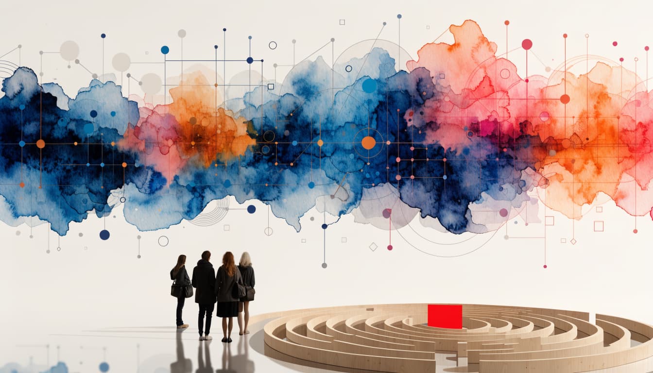
Walk into an IKEA store to buy a single lampshade, and you will leave ninety minutes later with a trolley containing candles, a bath mat, three tea lights, and — somehow — no lampshade. This is not an accident of bad wayfinding. It is the store working exactly as designed.
IKEA's showroom floor is built around what retail designers call a forced-flow layout — a single, meandering, one-way path that guides every shopper through nearly the entire store before they reach the checkout. There is no shortcut from the front door to the kitchenware aisle. You go where the path takes you, past every showroom, every vignette, every impulse bin, whether you intended to see them or not. The thesis of this piece is simple: IKEA has turned store navigation itself into a behavioral instrument, using a fixed path to maximise exposure, manufacture small commitments, and harvest the psychological rewards of progress — and the mechanism is copyable by any brand designing a physical or digital journey, not just a furniture retailer.
What is IKEA's forced-flow layout, and why does it matter?
IKEA's forced-flow layout is a continuous, one-directional route through the store, marked on the floor and reinforced by wall arrangements that discourage backtracking. Shoppers enter through the showroom, are routed through room-set after room-set, funnel into the marketplace hall of smaller goods, and only then reach the self-serve warehouse and checkout. There is no efficient way to walk in, grab one item, and leave.
This matters because it inverts the default assumption of most retail design — that friction is always the enemy. IKEA deliberately inserts distance between the shopper and the exit, and treats that distance as inventory: every extra metre of walking is another opportunity for a room-set to catch the eye, another product to be noticed, another idea for a home that didn't exist an hour earlier. In behavioural terms, IKEA has built a store where the path is the merchandising strategy, not an obstacle to it.
How does the winding path change what shoppers actually buy?
The forced path changes buying behaviour by converting passive browsing into repeated, low-stakes decision points. Each room-set is a self-contained scene — a bedroom, a home office, a compact studio flat — that lets the shopper mentally rehearse living with the product before they have committed to owning it. This is a variant of the endowment effect: once you have imagined a rug under your own coffee table, parting with the idea feels like a small loss, not merely declining a purchase.
The layout also exploits the goal-gradient effect — the well-documented tendency for people to accelerate effort and engagement as they perceive themselves nearing a goal. In a 2006 field study using loyalty cards at a café, researchers Ran Kivetz, Oleg Urminsky and Yuhuang Zheng, published in the Journal of Marketing Research, found that customers visited more frequently and spent more effort as they got closer to completing their loyalty-card stamps, even though the reward stayed constant. Applied to IKEA's floor plan, the same psychology holds: once a shopper has passed the halfway point of the route, turning back feels like wasted effort, and pressing on to "finish" the store becomes its own small goal — one that keeps the trolley filling long after the original shopping list has been satisfied.
The marketplace hall near the end of the route — stocked with low-priced items like candles, storage boxes, and kitchen tools — works as an anchor. After walking past fully staged living rooms costing hundreds of dollars, a $2 item feels almost free by comparison. This is anchoring at work: the earlier, larger price points recalibrate what feels cheap later in the journey.
Why does the showroom-to-warehouse structure matter for the emotional arc of the visit?
IKEA's store is built in three acts — showroom, marketplace, self-serve warehouse — and each act serves a distinct emotional job. The showroom sells the dream: room-sets are aspirational, styled, and designed to make the shopper picture a better version of their own home. The marketplace sells the impulse: smaller, cheaper, immediately gratifying items that convert lingering desire into an actual basket. The warehouse sells the transaction: flat boxes, forklifts, and a self-service model that reframes the shopper as a participant in the supply chain rather than a passive customer.
This structure closely tracks Daniel Kahneman's peak-end rule — the finding that people judge an experience largely by its most intense moment and how it concludes, not by the average of every moment along the way. The Nielsen Norman Group has written extensively about how the peak-end rule shapes designed experiences, noting that the ending of an experience disproportionately colours how it is remembered (Nielsen Norman Group). IKEA's route is engineered so the "peak" — the aspirational showroom — comes early, and the "end" is deliberately softened: the checkout leads past the bistro selling cinnamon buns and the food hall, closing the visit on something warm, cheap, and sensory rather than on the queue itself. A long, occasionally tiring walk is bookended by a strong opening and a comforting close, which is precisely what the peak-end rule predicts will be remembered fondly, regardless of how the middle actually felt.
What is the "IKEA effect," and why does it outlast the store visit?
The IKEA effect describes the tendency for people to place a disproportionately high value on products they have partly built themselves. It was named and empirically tested by Michael Norton, Daniel Mochon and Dan Ariely, whose study "The IKEA Effect: When Labor Leads to Love," published in the Journal of Consumer Psychology in 2012, found that participants who assembled their own furniture — even clumsily — valued the finished product significantly more than an identical, pre-assembled version.
This is the behavioural payoff that extends the in-store journey design well beyond the checkout. IKEA's flat-pack model isn't only a logistics decision that keeps prices low and shipping efficient — it is also the mechanism that turns a purchase into a personal accomplishment. The effort of building a wardrobe from an instruction sheet and an Allen key manufactures ownership in a way that a delivered, assembled wardrobe never could. The store gets the shopper walking; the flat-pack gets them building. Both stages are designed to increase attachment to the product, not just the transaction.
The store sells the walk. The box sells the build. Both are designed to make you love what you bought before you've finished paying for it.
Where does the forced-flow model break down?
No design mechanism is free of friction, and IKEA's is no exception. The most common complaint about the layout is precisely its strength turned liability: shoppers who arrive with a specific, urgent need — a replacement part, a single item, a quick top-up — experience the mandatory route as pure sludge, to borrow behavioural economist Richard Thaler's term for friction that serves the business rather than the customer. IKEA has responded over the years with visible shortcut signage and marked "quick" routes through some stores, an acknowledgment that forcing every visit through the full path risks alienating the time-poor shopper entirely.
This tension is worth naming plainly: a journey designed to maximise exposure for the browsing majority will always create drag for the transactional minority. The lesson for any brand borrowing this model is that forced flow works when the product category rewards inspiration — home, fashion, food — and works far less well when the customer's job-to-be-done is narrow and urgent. Designing the journey without segmenting for intent is where the model breaks.
What can other brands actually copy from IKEA's approach?
Few retailers can replicate IKEA's scale, but the underlying mechanics translate to almost any physical or digital journey. The following sequence is how a CX or service design team can adapt the model without simply copying a floor plan:
- Map the current journey stage by stage. Before redesigning flow, document exactly where customers enter, linger, and exit — physically or digitally — and identify which touchpoints currently get skipped entirely.
- Identify the highest-emotion moment and place it early. Following the peak-end rule, the most aspirational or delightful part of the experience should not be buried in the middle where it gets forgotten.
- Insert small, low-stakes commitments along the path. Each room-set, each sample, each interactive moment converts a passive browser into someone who has invested a little attention — and attention invested is harder to walk away from.
- Anchor price or effort perception deliberately. Sequence higher-cost or higher-effort touchpoints before lower-cost ones so the smaller ask feels trivial by comparison.
- Design the ending on purpose. Whatever the middle of the journey involves, the close — a checkout, a confirmation screen, a farewell interaction — should be warm and low-friction, because it is what gets remembered.
- Build a genuine shortcut for the urgent customer. Segment intent and give the time-poor customer an honest, visible way to skip the designed detour, rather than trapping them in it.
These steps sit at the intersection of service design and behavioural economics — the discipline of shaping physical and digital environments so that the path itself does some of the persuasion work, rather than leaving it entirely to marketing or sales effort. A well-mapped customer journey is what makes this kind of sequencing possible in the first place; you cannot engineer a peak-end arc you haven't first documented stage by stage.
What role do rituals play in why the model still feels good, not manipulative?
The reason IKEA's forced flow doesn't provoke the resentment that other high-friction retail experiences do is that it is wrapped in genuine, repeatable rituals rather than pure extraction. The in-store restaurant, the self-serve pencil and tape measure at the entrance, the play area for children, the returns desk that takes flat-pack boxes back without a fight — these are small, consistent moments that customers come to expect and, in many cases, look forward to. They function the way signature customer rituals function in any well-designed service: predictable, low-cost gestures that build familiarity and goodwill across repeat visits, softening the friction of the parts of the journey that are genuinely inconvenient.
This is the detail most retailers miss when they try to copy IKEA's layout without copying its rituals. A forced path without a warm ending, a comfortable rest point, or a moment of genuine service reads as manipulation. A forced path with those things reads as an experience people choose to return to, year after year, even when they know exactly what the store is doing to them.
What does this mean for retailers outside furniture?
The specific mechanics — flat-pack boxes, room-set showrooms, meatball restaurants — belong to IKEA. The underlying principles do not. Any retailer, from grocery to general retail to hospitality, is making a choice about how much of its floor, app, or booking flow to expose customers to, in what order, and with what ending. Most simply default to "shortest path to checkout," treating every additional step as pure friction to be engineered out. IKEA's four-decade bet says otherwise: exposure, sequenced well, is not friction — it is inventory that hasn't been noticed yet.
Retailers experimenting with this should be honest about the trade-off. Longer, more immersive paths increase average basket size for browsers and increase irritation for task-focused shoppers. Getting the balance right is a segmentation problem before it is a layout problem, and it starts with an honest audit of who is actually walking through the door and why.
The next time you find yourself three showrooms deeper than you intended, with a trolley you didn't plan to fill, it is worth remembering that nothing about that walk was accidental. Somewhere behind that winding path is a designer who understood that the shortest route between two points is rarely the most profitable one — and that a well-built path can make people grateful for the detour.
Further reading
FAQ
Questions we get on this topic
Related reading
Writing on how human behavior shapes the experiences brands deliver — at the intersection of behavioral economics and customer experience.
Stay ahead of CX
Get the Journal in your inbox.
Insights, frameworks and event round-ups from the Renascence team. No spam, ever.